


On Painting
Comment/ Philosophy (but Nice Readable Philosophy not Uber-Meta-Philosophy)

Quick Summary: In this Substack I talk about paintings! Part one is a funky thing I’ve noticed about how we can compare different paintings. Part two (philosophy warning) is a musing about how this could apply to scientific ideas of explanation. Part three is a comment on Berger’s ‘Ways of Seeing’ (thanks Aidan for the reccie!)
Paintings exist in space. That’s obvious. We stand, and we look at the painting in front of us, and there are lots of different colours arranged spatially. Some are above, some below, a splodge of blue on the left, a dash of red on the right. But my experience of the painting is in time. That is a little less obvious. I experience the world in time – that is to say, sequentially. I look at one thing, and then another thing, and then another. So my experience of the painting is a ‘time thing’. Maybe a look at the splodge of blue, and then the dash of red, and then the cute bumblebee hiding away in the top left corner.
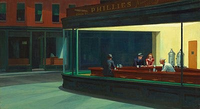
Sometimes the ordering of this ‘time-experience’ matters. The artist may dictate it with colours or forms. My eyes are ‘drawn along’ in Nighthawks (below) because of the way the light concentrates on the right, the lines of shadows acting as big ‘LOOK AT ME’ arrow pointing to the figures in the bar. There’s a lot of ways an artist can do this - like bright colours, composition, perspectival lines, gestures etc. All serve as ordering our ‘in time’ experience of the ‘in space’ object.
At other times, the artist communicates it through different means. Take a look at the painting below.

There’s the sky, there’s a man walking with his horse, a few mountains, and a ship.
Now I’ll tell you that the painting is called ‘Landscape with the Fall of Icarus’. Have a look again. See if you can spot why.
Right at the bottom, just below the ship, there are two legs in the sea. All of a sudden, the painting takes on a different cast. The sun in the background is ominous, and takes on a very wax-melty quality. The roots are foregrounded – maybe they could have snagged him – and the billowing sails of the ship become heart-breaking. If only Icarus had fallen five hundred metres back!
This exercise with ‘Landscape with the Fall of Icarus’ makes clear to us how our time-ordered experience of a work changes. There’s a pleasing contrast between the time-ordering given by the work (your eye going from the man in the foreground, to the ship, to the mountains and sun), and the time-ordering given by the title (scanning going ‘where the fuck is Icarus???’). Bruges has had fun playing with the discrepancy between the two different time-orderings suggested.
And I think artists play with these time-orderings in other ways. Think of a Jackson Pollock or Picasso’s Guernica – where you end up lost in the whole clash and there’s no neat or natural way of knowing what to look at ‘first’. Here, the point is that there is no obvious time-ordering. That also says something to us. We know that when we’re looking at the painting, our time-ordered-experience is slightly arbitrary.

In the album cover above, I looked at Ringo Starr first because of the pink, then the Doris Day actress because of her sassy ‘Who Me?’ vibe, then the creepy judge doll by the trumpets, and then I stopped to write this down before I forgot. You probably looked at something different – and this is suggested by the work. There’s a kind of arbitrariness about where we choose to focus our attention. You do experience a particular time-ordering of different things as you look at the cover (you have to!) – but you’re aware at the same time that you could have followed a different pattern.
So what? Well, I think this matters. Our awareness of arbitrariness communicates something to us. It tells us all these things are on an equal footing. Unlike in ‘Nighthawks’, where the most important thing is the people talking on the right, when we’re aware it’s arbitrary where we’re looking, it tells us that nothing is above something else. In the Sergeant Pepper Lonely Hearts Club album I think that’s sort of the point - all these cool people, all different, all equally worth looking at. We’re still experiencing something ‘in order’ – in sequenced slices of time – but we’re not making quite as much of that fact. The ‘time-ordering’ doesn’t bear a relation to importance.
This is why art is sometimes better at communicating than language. I’ve written about languages linearity elsewhere (see ‘On Writing Awe’ for more). Think about how you read this paragraph – you’ve moved from my point about why art can communicate better than language, then to how language is very linear, and now here you are at the full stop. (Ta da!) Language has a linearity, this ‘time-ordering-priority’ built in. Art doesn’t.
Well… so what again! I think we’re paying more attention to how language has priority built into it. You see it a lot in discussions about Israel-Palestine. People become angry about one side being spoken about first – because it is seen as prioritising. It’s a strange, inescapable value judgement. You have to talk about one side first, because that is how language works (we can’t talk in two registers simultaneously). So people tie themselves in knots as they speak to avoid implying a value judgement they don’t want to make.
Ridiculously, and on a far more trivial topic - I first noticed this with someone I fell out with. I felt a massive muddle of emotions towards them, and I couldn’t envisage putting a single one first. But I’d have to if I was going to say anything. In my imaginary resolution, I settled on showing them a drawing with different colours, each representing an emotion, and asking them to choose - so I didn’t have to put one first. Language has a built-in priority, and my feelings didn’t.
Arbitrariness, and awareness of arbitrariness, is cool because it puts things on an equal footing, which is particularly useful when language has a strong tendency to not do that – to always put one thing above another. We invoke arbitrariness sometimes, stressing that an ‘Acknowledgements’ section is in no particular order, or deliberately putting something alphabetically. I wonder how arbitrariness can be communicated in other ways - if bodies like the BBC could deliberately introduce coin-toss randomising for certain pieces to avoid accusations of bias.
In terms of Aesthetics, degrees of freedom or arbitrariness can be used to compare different kinds of artworks. We spend a lot of time looking at the similarities in where our attention is directed – in both Giacometti’s ‘Piazza’ and Degas’ ‘The Dance Class’, we’re directed to look around the negative space in the centre. But we don’t spend a lot of time looking at the degree to which different paintings do so – how forcefully they direct our attention or how much we’re aware that we make up our own mind about what we look at. We don’t have Arbitrariness Metrics, and I wonder what comparisons this sort of metric would let us make.
***
[Philosophy Warning']
Interestingly this idea of orderings makes painting a bit like an explanation. Explanations are generally thought of as an answer to a ‘why’ question. One element of an explanation is giving information - I need to give facts about somethings causal history to explain how it came to be.
But it’s not just about giving information. If you ask me ‘why is the sky blue’ and I tell you absolutely all information ever - I haven’t given you a good explanation. If I ask ‘Why is the price of bread going up?’, I really don’t want to hear ‘Because there was a Big Bang’.) In explanations, like in paintings, the ordering in which information is given matters - and in an explanation, a clear, structured ordering has traditionally been taken as a virtue.
But in a painting, the value of a clear, structured ordering seems … less clear-cut. There’s a trade-off because there are benefits from ambiguity - the ambiguity itself can be communicative (as in Sergeant Pepper), and reflect some things better than a painting with a ‘strong’ ordering. And I wonder if this also suggests something about explanations - that sometimes a less clear, less structured ordering can communicate things better than a more structured one, particularly in uncertain situations.
***
Last one - I’m reading Berger’s ‘Ways of Seeing’ at the moment. It’s always given me a headache, so I’m trying to puzzle out what is going on. I’ve written a longer guide here, but this just has the most relevant pieces.
In the end of Chapter 1, Berger talks about the development of the camera and how this changed perspective. With the invention of film, images became things that could be ordered in time as well as space - and in doing so ‘showed that the notion of time passing was inseparable from the experience of the visual (except in paintings'). What you saw depended upon where you were when. What you saw was relative to your position in time and space’. I think Berger’s painting-exception is motivated by something similar to my idea of arbitrariness above, and he uses film to show how looking isn’t only spatial (what you see), but also temporal (when you see it).
The way that films force us to look at things in succession has a particular effect. It 'constructs an argument which becomes irreversible’ whereas ‘in a painting all its elements are there to be seen simultaneously... whenever he reaches a conclusion, the simultaneity of the whole painting is there to reverse or qualify his conclusion.’ Films, by forcing our attention to operate in certain ways, trammel us towards a particular conclusion. Paintings don’t. And I guess my suggestion above is that some paintings act a bit like films. They trammel us too - it’s just easier to mitigate this trammelling in paintings, where we can easily look elsewhere, than in film - where the images disappears so we can’t.
Last up - Berger recognises the potential of this different language of images. He suggests that ‘within it we could begin to define our experiences more precisely in areas where words are inadequate.’ So that’s a nice piece of confirmation bias for me.
Have a smashing week everybody!
Lauren xxx
12. Cent Mille Milliards De Poémes - 10 pages, with 10 lines, cut and seperated - can be combined back and forth to make 200 million years of continuous reading - here again, the weight of possibilities implied
Like a shape seen in the distance, sketchiness has the power to suggest multiple realities at once. Monet’s dark-gray squiggle in the Le Havre water might be a rock or a boat; certainly it is a squiggle of paint. Emphasizing the physicality of the image—the gloppiness of the paint, the visible canvas below—calls attention to the instability of the illusion.